A Forex chart and visualization of price movements
In Forex, just like in any other financial market, charts play a major role. They help traders conduct technical analysis. Asset prices change frequently. They move from point to point and there are occasions when they leave certain patterns. Traders study these patterns and try to capitalize on them.
Some types of charts in Forex are better at finding those patterns, while others reduce market noise and make trend trading easier. Each chart type have its own strengths and weaknesses and based on your strategy, you should choose the ones that can add the most value to your trading system.
How to read Forex charts?
The FX charts, just like the ones available for other assets, make current bid and ask price movements much more apparent and easy to observe. Usually, these movements will be shown in lines, columns, or any other form. As for the time frame, the prices will be recorded against a tick (the smallest change in price), a minute, an hour, a day, etc. Traders can select from various chart time frames. Long term traders use longer than 1 hour charts, while intraday traders use anywhere from 1 min and up. Many traders use charts for conducting a multi timeframe analysis. For instance, day traders use 1 day candle time frame charts to observe general trend directions and 1 hour or lower charts for trading local trends or reversals.

All charts, be it for currencies, commodities, etc. have basically the same layout in terms of the price and time representations. Understanding forex chart terms and their types is critical for choosing the right type for your strategy. The x-axis (which is the vertical line) shows the time along which the price went up or down; the y-axis (which is the horizontal line) shows the price at a certain time.
Because there is a time dimension in a chart, traders can view the prices that were quoted in the past. And since we’re reading Forex charts, this price will be an exchange rate of the currency pair. And depending on which time frames a trader picks, the price movements will be shown in ticks, minutes, hours, days, or even years – and it is pretty easy to go from one to another by zooming in or out.
Different types of Forex charts
Almost all Forex brokers offer free charts to their clients that are included in their trading package. And when traders download MetaTrader 4, MetaTrader 5, or cTrader (trading programs), the charts will automatically be available for them. Apart from brokers and their trading software, there are also third-party charting programs like TradingView that provide currency price charts for free. It's worth noting that TradingView is not a broker. Many traders use charting methods of the service provider and place orders using MetaTrader or other trading platforms.
In Forex, there are many chart types, however, the most popular ones are the 3 types of forex charts:
- Line charts
- Bar charts
- Candlestick charts
Let’s take a look at each of them.
Line charts
In Forex, a line chart is the most basic and simple price representation. Basically, it marks various price points of a certain asset on the diagram and then connects the neighboring points to each other with a continuous line.
Now, while line charts are very simple to understand, they’re too simple, actually. That’s because they only depict the closing prices of currency pairs. So traders who want to get more complex information like opening or highest/lowest prices, the line chart wouldn’t provide that to them.
The line chart forex traders use, help smooth out market noise, and they make trend trading easier. However, you won't be able to use them for spotting price patterns as easily as by using candlesticks. Forex line chart is mainly used in indicator values and traders use them less and less for displaying currency pair prices.

Bar charts
Unlike the line FX chart types, bar charts are more complex and offer even more information than the previous one. Basically, this bar represents four different prices of a currency pair in a given time period – either minutes, hours, days, or higher.
Here are those four prices: the top and bottom ends of the bar represent the highest and lowest prices of the asset in that time period; a short vertical line on the left shows the opening price and the same one on the right shows the closing price. Bar charts are more common than line charts, however, most traders prefer using the candlesticks in their analysis.

Bar charts are far more complex than line charts for obvious reasons: while the line chart represents one price, the bar chart does that for four different prices. But when it comes to the most complex chart type, even the bars aren’t enough.
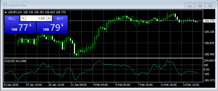
Candlestick – the most popular FX market chart
Japanese candlesticks show the similar information as the Bar charts. The only difference is in visualization. Candlesticks are more appealing for traders as they have thicker bodies and make patterns easier to find. There are various candlestick patterns discovered by traders and analysts in the market. The patterns are an important part of technical analysis.
The Japanese candlesticks come from Japan. It was easy to guess the origin country from its name, but did you know that the chart type was developed by rice traders? The rice traders were creating the charts using hand in order to determine the best trading prices. They have also discovered various patterns that tend to reoccur overtime.
The candlesticks enable traders to observe the battle between bulls and bears and look deep into the market's psychology. This is why they have become so popular today. The candlestick chart is the most popular method for visualizing Forex price movements in a given period of time.
While bar charts only show four prices in just one time period, and line charts only show one price in a longer time frame, the candlestick chart shows four prices in a longer time frame (depending on trader’s preferences). In short, the individual bars are arranged in a given time period, and they show opening/closing and high/low prices of a currency pair.
In this chart type, the space between the short vertical lines (open/close) is called the “real body” and it indicates whether a trader had a successful trade or not. If the real body is white/green, this means that the opening price was lower than the closing price and the trader sold a pair at a higher price and gained a payout. And if the real body is black/red, the opening price was higher than the closing price, which means the trader sold a pair at a lower price and lost some funds.
Trading Forex charts in technical analysis
Now that we have explained what charts are in Forex and what types are the most popular, one question remains unanswered: why do traders use Forex charts?

Technical traders that study patterns and use indicators extensively, will use candlestick charts. Traders that are purely fundamental and care about general price trends, might use line charts. Line charts are simple and easy to observe. Line charts are not for intraday traders as they lack highly important information: open, close, high and low prices within a given time frame.
Technical analysis in Forex is basically a method of reading charts and speculating, whether the price of a Forex pair will increase or decrease in the future. There are two possible scenarios that can be “read” from charts:
- If the exchange rate of a pair is increasing from the left side of the chart to the right side, it means that the market is in an upward trend – it’s basically expanding and buyers are in a favorable situation;
- If the exchange rate is declining from the left side of the chart to the right side, it means that the market is in a downward trend – it’s contracting and sellers are in an unfavorable situation.
These scenarios may seem very simple, but usually, such trends prove to be long-term. However, that’s not to say that the live chart Forex diagrams always lead to correct conclusions and that they are always right. That’s because they are not. In some cases, the upward/downward trend may change dramatically because of a sudden occurrence on the market. That’s why we used the term “speculation” to describe this method.